Bold Colors or Soft Neutrals? Choosing the Perfect Palette for Your Salon

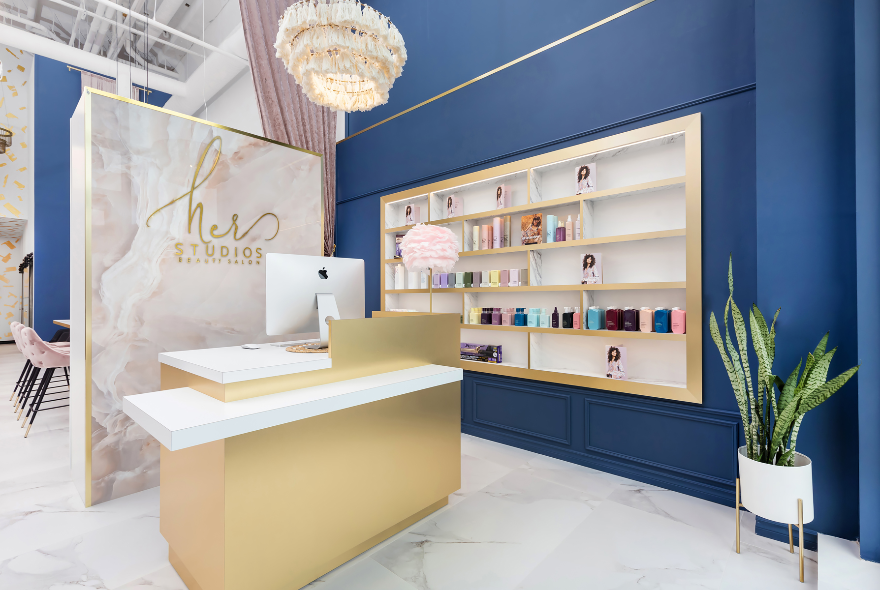
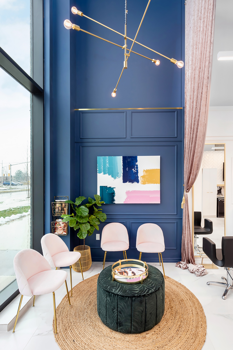
Her Studios design by Fiore Design Group
When designing your salon or spa, the color palette is more than just an aesthetic choice—it’s a crucial factor that impacts your branding, client experience, and even employee morale. As an experienced salon or spa owner, you’ve likely noticed how the ambiance of your space plays a role in client retention and satisfaction. But how do you decide between bold colors or soft neutrals for your palette? Let’s explore the considerations and the psychology behind colour that can help guide this decision.
The first step is aligning your color palette with your brand’s identity. Bold colors, such as vibrant blues, oranges, or greens, are excellent for salons aiming to project energy, creativity, and a youthful vibe. On the other hand, soft neutrals like beiges, grays, and off-whites create a sense of calm, luxury, and sophistication. If your salon caters to a trendy, high-energy crowd, bold colors might be the way to go, but a spa or upscale salon focusing on relaxation and indulgence, neutrals and pale shades will give a sense of calm.
Aligning Your Palette with Your Client Demographics
Your salon or spa’s aesthetic environment should resonate with your target clientele’s expectations and preferences. As a salon owner, understanding your clients’ demographics and behaviors is crucial to creating a space where they feel comfortable and catered to. This consideration goes beyond service offerings and extends to the colors and design choices that set the tone of your establishment.
Younger Clients: A Bold and Trendy Approach
For younger clients, especially those in their teens, 20s, or early 30s, vibrant and dynamic environments often resonate. Bold colors such as rich purples, energetic yellows, or playful pinks can communicate creativity and a modern vibe. These clients are frequently drawn to edgy, experimental styles, and a colorful palette signals that your salon stays ahead of trends. Incorporating accent walls, bright furniture, or funky artwork can make your salon Instagram-worthy, an essential factor for this demographic.
Families and Older Clients: Comfort and Sophistication
Families or older clients typically prefer calm, reliable, and welcoming spaces. Neutral tones—such as soft beiges, grays, or muted blues—create a timeless, relaxed atmosphere. This demographic often values comfort over trends, so a subdued palette can make them feel at ease and catered to. Additionally, neutral colors reflect sophistication and stability, aligning with clients’ preferences seeking traditional or classic beauty services.
Cross-Generational Appeal with Neutrals
If your salon serves a broad age range, a predominantly neutral palette with strategic pops of color can appeal to everyone. Neutral tones act as a blank canvas, exuding elegance and flexibility. This allows you to incorporate temporary or seasonal elements in bolder colors that draw attention without alienating clients seeking a serene environment. For example, a neutral base with gold or blush pink accents can balance modern flair and timeless charm.
Cultural and Regional Considerations
Client preferences can also vary by cultural background and regional trends. Bright, bold colors may be more appealing in areas where vibrant cultural traditions play a role in aesthetics. Conversely, salons in suburban or upscale urban areas might find that soft, muted tones better align with client expectations for luxury and minimalism. Understanding local tastes ensures your salon feels relevant and aligned with community norms.
Evolving Preferences and Trends
As trends evolve, so do client expectations. Younger generations increasingly value spaces that reflect individuality and creativity, while older clients might now be open to contemporary designs that balance boldness with elegance. Staying informed about shifting preferences through client feedback or trend analysis can help you adapt and innovate while remaining true to your brand.
The Psychological Impact of Color
Color psychology plays a pivotal role in your clients’ moods and behaviors. Warm, bold tones like reds and oranges can energize the space, while cool blues and greens promote calm and trust. Neutral colors tend to make a space feel expansive and balanced. For salons offering a mix of services, consider combining both palettes: use bold accents in specific zones like the nail or retail area and soft neutrals in areas meant for relaxation, such as spa rooms or shampoo stations.
The colors you choose for your salon or spa directly influence how clients perceive and experience your space. Each hue evokes specific emotional responses, shaping the atmosphere and affecting client behavior. Understanding color psychology can help you strategically design your environment to enhance client satisfaction and align with your brand’s goals.
Warm, Bold Tones: Inviting Energy and Passion
Warm colors like reds, oranges, and yellows are associated with energy, enthusiasm, and vibrancy. These shades can make your space feel dynamic and welcoming, perfect for salons that cater to trendy, high-energy clients or specialize in bold styles. However, too much red can feel aggressive or overwhelming, while orange can exude warmth and creativity when paired with complementary hues. These colors work particularly well in focal areas, such as the retail section, where you want to grab attention and encourage interaction.
Cool Colors: Calmness and Trust
Cool tones like blues, greens, and purples evoke relaxation, trust, and balance. Light blues, for example, can create a serene atmosphere, ideal for spa areas or massage rooms. Green, often associated with nature, conveys health, renewal, and harmony, making it an excellent choice for spaces focused on wellness. Deeper shades of purple can add a touch of luxury and sophistication, particularly in high-end salons. These colors are perfect for areas where clients need to unwind, such as shampoo stations or waiting lounges.
Neutrals: Balance and Versatility
Neutral tones, including whites, grays, and beiges, provide a timeless, sophisticated backdrop that feels clean and expansive. They also allow bold accent colors to shine without overwhelming the space. For salons aiming to accommodate a wide range of client preferences, neutrals can create an adaptable environment. Additionally, they reflect light well, making smaller spaces appear larger and brighter—an essential consideration for compact salons.
Combining Palettes for Multi-Service Salons
For salons or spas offering a range of services, blending bold and neutral tones allows you to define specific zones and enhance functionality. For instance, bold colors can energize high-activity areas like nail stations or retail displays, drawing attention and stimulating interaction. In contrast, neutral or cool tones are better suited for relaxation zones, such as treatment rooms or waiting areas, helping clients feel calm and cared for.
Consider the Psychological Subtleties
While these general guidelines provide a foundation, subtle factors also come into play. For example, bright yellows can inspire positivity but might become overwhelming under intense lighting. Similarly, muted greens can create a relaxing environment but might feel dull if overused without contrasting accents. Combining color psychology with lighting and textures ensures a harmonious result.
Tailoring to Your Clients’ Needs
Ultimately, your color choices should reflect your brand identity and your client’s expectations. Understanding how they interact with your space can guide where and how you use specific colors. For example, bold tones in interactive areas might inspire conversation, while soothing colors in quieter zones can help reduce stress.
Getting Longevity From Your Color Design Decision
Practicality and Maintenance
Bold colors, while striking, can demand frequent upkeep as they may show wear and tear more prominently over time. Neutrals are often easier to maintain and tend to age more gracefully. For high-traffic areas, darker bold tones can help mask scuffs and stains, while lighter neutral shades need regular refreshing to maintain a pristine look. Choosing durable materials and finishes in your desired palette can also make a difference.
Flexibility and Future Trends
Neutrals provide a timeless foundation that can adapt as trends evolve. They allow you to refresh your space with bold accents or seasonal touches without a complete redesign. Bold palettes, while attention-grabbing, may feel dated more quickly if not chosen carefully. For balance, you could incorporate bold colors into furniture, artwork, or signage, keeping walls and flooring neutral for a versatile base.
Test and Evaluate
Before committing, test your chosen palette in your space. Use swatches, mood boards, or digital renderings to see how the colors work together and reflect your lighting conditions. It’s also wise to involve your staff and loyal clients—they’re part of the environment daily and can offer valuable insights. Look at a paint chip on a wall in the lighting in that area. It will appear different in natural light versus halogen or LED lighting.
The decision between bold colors and soft neutrals depends on your brand, clientele, and long-term goals. By blending color psychology with practical design principles, you can create a salon that looks beautiful and enhances the experience of everyone who walks through your doors. Whether bold or neutral, your palette has the power to make a lasting impression.

Her Studios design by Fiore Design Group


